

Lucent
Report Parser & Publisher
Objective
Take a report written in Microsoft Word and make it more efficient to publish to the database.
Stakeholder Needs:
Streamline & automate data population
Reduce and prevent redundant data
Outcome:
90% time saved when publishing a report
Role: Lead Designer
Responsibilities: End-to-End UX & UI Design
Company: Kessel Run
Research Methods: competitive analysis, interviews, usability tests, workshops
Timeline: 2022 - 2024
Note: Due to the sensitive nature of military programs, the data, designs, and metrics in this case study have been highly sanitized for public release.
Problems
Tediously repetitive and redundant data entry
That sums up what our users, the publishers, had to deal with when disseminating Intelligence Enhancement (IE) reports to the database. Each report is made up of several sections.
As the last step in the process, they need to ensure their team’s hard work is accurately shared to the wider community.

They had to copy the contents from a Microsoft Word document and then paste it into an outdated site. It was an unfortunate necessity because there were no other options to do this work.
And then they had to fill out multiple fields about the contents they just pasted.
It became a laborious trial & error process when users tried to resolve issues:

Codes: Each section requires a code in the proper format or it will be rejected by the system. This can be a problem even for experienced users due to a lack of training and resources.

Microsoft Word: Many issues stemmed from Word’s formatting doing “weird things” when pasting text from the document to the database.
"It’s extremely time consuming to go through each report to make sure there aren't those little issues like extra spaces and indents.”

Old Software: Users have to deal with cognitive overload due to the database itself being out of date and unintuitive. Dense layouts and poor copy lead to mistakes when filling out fields.
These mistakes then lead to duplicated or abandoned reports, forcing users to either delete data (its own tiresome process) or start over.
And this is just for completing one section! As the “sanity check,” publishers often review their work multiple times since the database is not good with field validation and error prevention.
A Rocky Start
For the first year, I was only talking and testing with our primary stakeholders. I learned from my PM that there was an unspoken concern we wouldn’t be able to deliver, and they didn’t want to potentially waste their publishers’ time.
The risk I brought up was that we would be addressing the biggest pain points as perceived by our stakeholders rather than the day-to-day users. I didn’t know if I would be able to effectively address both the business and user needs if they ended up too different.
I also had to unexpectedly work as the sole designer for several months because the other designer moved on. Since it was my first project, I felt a lot of pressure to make sure we were moving in the right direction.

One of several workshops I facilitated with the whole team to figure out our MVP, among other things.
Thankfully, I couldn’t have asked to be on a better team. Trust and open communication allowed us to move quickly without sacrificing quality. Morale rarely wavered even when times were stressful, and we had a lot of challenges ahead.
Report Parsing & Automation: Lightening Their Load
The constant back and forth between Word doc and database sounded like a Sisyphean nightmare, but publishers simply had to endure it because there were no other options.
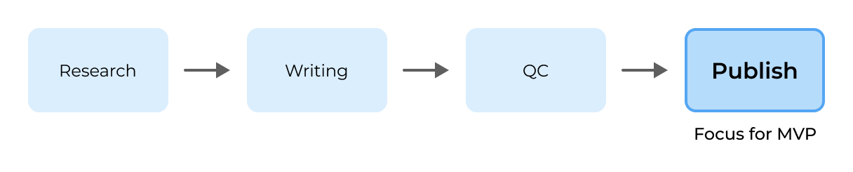
Once the devs figured out how to parse Word docs, we were able to break down the goal of Lucent into 4 parts:

Upload: Allow users to upload their reports.

Parse: We would parse them and then display the text from each section of the report.

Autofill: Most, if not all, of the required fields would be autofilled.

Publish: Allow users to publish to the database.
There would be no need for repetitive or redundant data entry. Users could simply double check that everything was correct and fill out fields that weren’t autofilled. Initial usability tests were extremely positive.
“Manual input is a time suck, so this will be a lifesaver. Super helpful.”
While users were delighted to see their reports parsed into the app, we soon started seeing an issue come up:
“My report isn’t uploading right for some reason. The text looks messed up.”
While our parsing feature worked well, it only did so if the users were using the official report template. Many issues occurred when they used some of Word’s formatting features:
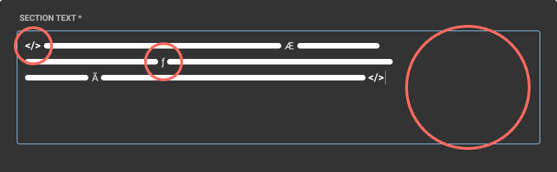
When parsed, those formatting options caused all sorts of strange characters, code, and empty areas to be displayed.
(¯\_(ツ)_/¯ I don’t know how to code, the devs just showed me something like this)
Some users were also writing in older versions of the report template. It wasn’t an issue before since they were manually copying and pasting text into the database, but it did affect how Lucent parsed their reports.
At first we tried addressing each case, but it was time-consuming and not sustainable for our small team.
Rather than try to account for every edge case, I proposed we put a link to download the latest template on the upload page. Funneling users towards that was more practical than spreading ourselves too thin:
Thanks to that simple addition, we were able to eliminate nearly all of those reported issues.
“I’m kind of excited at the potential.”
Modernized Layout: An Improved Flow
Reducing cognitive overload was one of my first priorities when designing the layout. Before I joined the team, there was an early design that displayed the report on the left side and our parsing results on the right.
While I understood why that layout was proposed, I felt like there were better uses for the screen space that were more user-friendly.

The idea was that users could compare their report to the parsed results.
I researched e-commerce flows, travel sites, and online magazines to figure out how to guide users through Lucent:
I suggested a single column for all of the data fields at first, but for the sake of space the other designer pushed for them to be split into two columns instead. I agreed since it didn’t matter what order the fields were filled out:
As a gentle nudge, I believed it would be good to number them anyway. It had the unexpected benefit of making it easy for both users and the team to point out problems:
“I had a problem with fields 4 and 8 in section 1.”
An issue did come up during early usability tests where users weren’t filling out some required fields. Because they had placeholder text for labels, it looked like everything was already autofilled for them:
It wasn’t until users tried to click the checkbox to mark a section as complete did they see that there were missing required fields to be filled out:
I decided that defaulting to the floating label state would make it easier to spot which fields were empty:
"I really like the look of this. Really clean.”
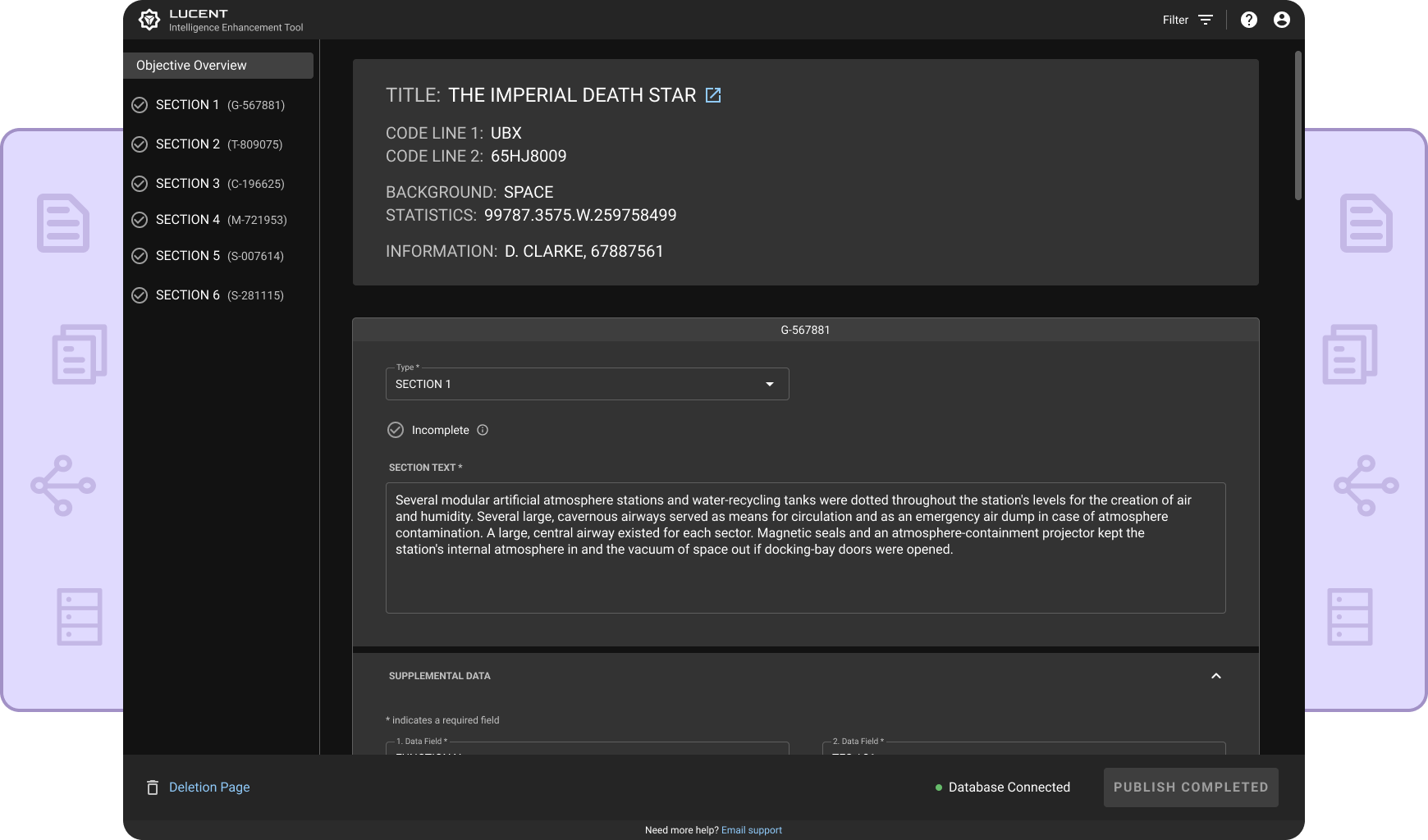
Sidebar: Overview at a Glance
During usability tests, I saw users scrolling up and down the page to review information. A navigational sidebar was added to make it easy to go to any section in a report.
While apps like MS Word and Google Docs have outlines that can also be used to navigate to specific parts in a document, I wanted to meet the specific needs of our users.
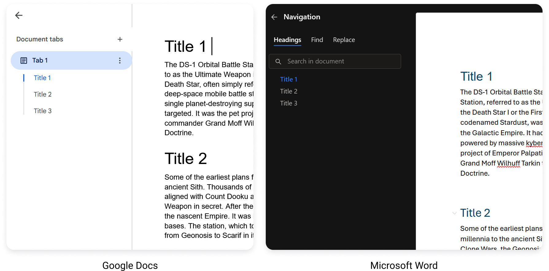
Being able to go to any section with a click allowed them to double-check things more efficiently, too.
One user suggested that we add each section’s unique code to the sidebar since it was important information that helped to distinguish one from another:
“It’s great having a quick nav. Very modern & intuitive. Reports can get so long.”
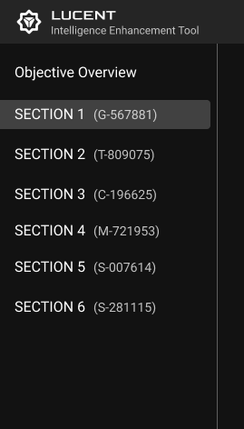
States: A Mood Ring for Sections
After hearing from several users about how much they double-check their work, I designed state indicators to help them easily track their progress and spot issues.

These icons were added to each section as well as the sidebar. Users could easily see the states of an entire report without needing to scroll:
A section going from the Incomplete state to the Completed state.
Users could also filter by states since I knew their reports could be quite long:
“I like that. Helps reduce clutter.”
Although the filter was easily understood, users expressed some concerns that sections of their report were possibly gone. To try to alleviate those worries, all sections are still displayed in the sidebar, but are disabled when they’ve been filtered out:
While scrolling through the page, the highlight in the sidebar simply skips past filtered sections.
“Very simple. Totally makes sense.”
Publishing: Smoothly Across the Finish Line
Users typically worked from top to bottom in Word when publishing each section of their reports because it made it less likely that something would slip by. It wasn’t uncommon for users to go back through multiple times to ensure they didn’t miss anything.
Thanks to our sidebar showing section states, users could now see what’s complete and incomplete:

“It helps check things off and keep track of the process.”
A unique feature in Lucent is that we allow users to publish multiple sections at once rather than one at a time as they were accustomed:
I matched their existing workflow where it made sense in order to ease their transition, but I knew we had to win them over in ways like this that made choosing Lucent the obvious choice.
“Very easy to use. Much better than all the dropdowns and button clicking.”
Simplifying Deletion: Bye Bye Bye
In the database, several steps were required to delete a single section. Copy could be vague, which made some users hesitate:
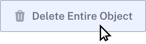
“It made me think, ‘Does that mean the entire section or the entire report?’”
Early on, I brought up that if we were going to allow users to publish something we would also need a simple way for them to delete it.
Typically, users deleted outdated sections from the database after publishing the new ones, so we wanted to make it easy for them to do so in Lucent:
The deletion page used to look similar to the report page, but I realized it could be confusing as well as inefficient. Instead, a standard table design was used to not only make it visually distinguishable from the report page, but also allow for quicker visual scanning and selecting:
Users commented that they already knew which outdated sections would need to be deleted, so they appreciated the simplified look:
For reassurance, we still allowed them to see the details of each section.
Considering the importance of what would be deleted, some strategic friction was needed. We wanted the process easy, but not too easy (a sentiment shared by our stakeholders):
“Much easier and faster, definitely value there. This will save us from having to click so many times."
Conclusion: The End is the Beginning
Results:
IE report publishing time reduced by 90%
Hundreds of hours saved for publishers in the first few months of use alone.
Reduced cognitive load: Autofilled data, report-specific structure, and scannable states make publishing far faster.
Prevents and reduces redundant reports thanks to synchronization to the database and a simplified deletion process.
Intuitive: Users are able to learn how to use the app easily without needing a manual, saving additional time in training.
The team knew we had an uphill struggle to gain adoption and win people over. If we wanted to provide more IE report authoring capability, we had to show everyone that we could be trusted with the last crucial step of the process.
“Really excited about these cool features.”
Users were able to improve their publishing time significantly within a couple of reports, showing how easy it was to use the app. One user joked, “What are we going to do with all of this extra time?”
And that was ultimately the goal, to give more time to publishers to do other valuable, impactful work. After graciously helping us understand what they needed, it made us happy to give them something truly worthwhile.

Despite feeling like I was designing in the dark at the beginning, things worked out amazingly due to Lucent’s healthy team culture.
My product manager was always clear in what he was looking for, which allowed me to best support him in engaging with stakeholders and our organization’s leadership.
Our developers were exceptionally easy to work with, helping me understand and be aware of technical complexities when I explained my design decisions.
Rapid iterations couldn’t have happened without the other two designers’ open-mindedness and unique perspectives.
We knew we had much bigger challenges ahead, but now we had experience, momentum, and user trust on our side.