

Lucent
Source Manager for Reports
Objective
Give users a simple, cohesive way to organize, reference, and cite their sources.
Stakeholder Needs:
Automate data population
Develop user roles and capabilities for quality controllers (QCers)
Outcome:
75% of users switched to managing their sources in Lucent, including the largest key group.
Role: Lead Designer
Responsibilities: End-to-End UX & UI Design
Company: Kessel Run
Research Methods: competitive analysis, interviews, usability tests, workshops
Timeline: 2024 - 2025
Note: Due to the sensitive nature of military programs, the data, designs, and metrics in this case study have been highly sanitized for public release.
Problems
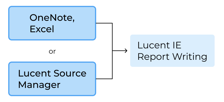
Juggling multiple apps while dealing with a lack of standardization and confusing format requirements
Creating an Intelligence Enhancement (IE) report typically goes through 4 phases: research, writing, quality control, and publishing. Analysts have to cite sources used to write their report so that QCers can check for accuracy.
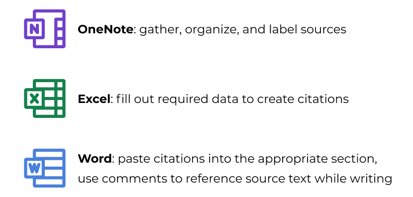
It wasn’t uncommon for analysts to struggle to find sources. Once they did, they would paste source text into Microsoft OneNote along with details for the citation. Analysts don’t always list all of those details, so QCers have to spend extra time tracking down and verifying sources.
That can be made more difficult due to the lack of standardization in the use of OneNote. Each analyst had their own way of organizing notes, forcing QCers to also spend time figuring that out:
One section or multiple sections? One page or multiple pages? Is everything labeled correctly? Is anything missing?
One analyst had a catastrophic incident where OneNote crashed and lost a large amount of work, forcing her to completely redo her report.
“After that experience, I never used OneNote again.”
Source citations were a common pain point due to their confusing format and lack of clear guidance. Microsoft Excel was used to make it easier by entering data into cells and generating citations they could then copy & paste into their Word doc:
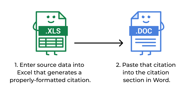
A lot of copy & paste, copy & paste…
Source Manager Goals:
Establish a new, structured standard that was easy to adapt to
Eliminate repetitive data entry with automation where possible
Make it simple for both analysts and QCers to check their work
Integrate with Lucent’s report writing capability in an unobtrusive way
Lucent Roadmap: Internal Misalignment
One of our product managers was hesitant about bringing in this capability, wanting to let an external app handle it through an API. The other designer and I believed it would be better for Lucent to handle all of the IE report process, especially since the other app didn’t have anything promising to show yet.
We also believed that Lucent would be able to adapt to feedback faster if we handled source management.
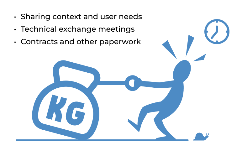
Trying to work with another app would have slowed us down at a time when moving quickly was vital.
Eventually our team agreed to give the other app some time to bring things to fruition while we focused on the writing part of the process (see Report Creator case study).
During a later touchpoint, however, it became clear that they wouldn’t be able to get where we needed them to be. Our PM reluctantly agreed to begin work on source management while trying to keep the door open in case the other app was able to come back to the table.
As frustrating as it was at times, it helped me to be aware of potentially costly actions that couldn’t easily be undone, and having other options that allowed us to push forward in such situation.
Integration: Overcoming Resistance
There were always users who were initially hesitant to switch to Lucent. Unless there was a mandate to use our app, I said that some people will “prefer the devil they know to the devil they don’t.” Keeping that in mind, we designed source management in Lucent to be optional:
The idea was that as they became more comfortable writing their reports in Lucent, they would naturally explore our source management features. We also hoped that positive word of mouth from our “brand champions” would draw in more users.
While we designed source management and writing to work together, keeping the features separated by tabs allowed for freedom in users’ workflows.
Layout: From Stitched to Seamless
Users had no choice but to Frankenstein together Word, OneNote, and Excel to get the job done. While it was easy for us to say, “We’ll take the good from those apps and remove the bad,” blending those good things together and integrating them with the writing features was far more difficult.
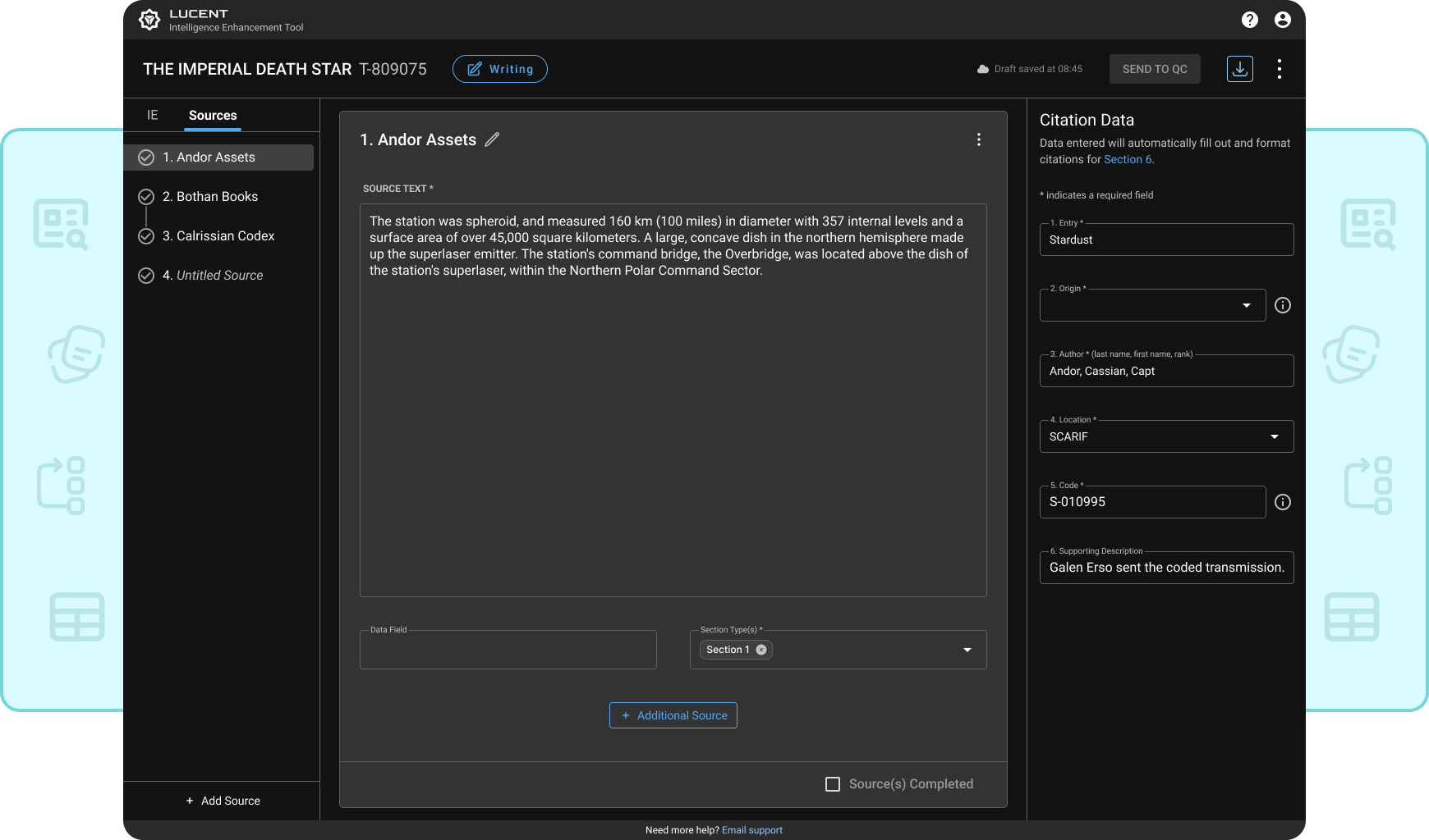
At first our layout for sources resembled our layout for report sections. We thought having a similar structure would make it quicker for users to learn and visually scan:
Like sections, there was a checkbox to mark sources as complete. It would also prompt analysts to fill in any missing required fields:
By making sure that analysts fill out all the required fields, it also saves time for QCers.
Citation Iteration: Cut from the Same Cloth
When we explored various task flows, we realized we needed to rearrange the placement of the fields. Some sources come from the same place, so there could be multiple sources that share the same citation data.
Since we wanted to avoid repetitive data entry, we had to separate fields into two groups:
Fields that are specific to source text
Fields that are specific to source origin
We put the origin fields in a right panel while specific fields remained under the source text. To add a source that came from the same origin, we put a button below the latest source.
By grouping sources this way, it improved organization, saved time in data entry, and made reviewing sources easier.
Because we had heard from users that some citation fields were confusing, we added helper text and info icons where necessary. We had to ask many senior level users about nuances, use cases, and formats for many of these fields, so we understood why they caused confusion:
The consensus from users was that it was more straightforward & organized than their current process.
"Nice to look at. It’s not as cluttered."
Sidebar: Navigation and Reorganization
Sidebar navigation made sense from the outset, but it needed more planning with our devs. Users said that being able to reorganize their sources was important because the order they add them always differed from the order used in the report itself.
Reorganizing was done with the use of drag handles. Users appreciated that sources were automatically renumbered.
We worked closely with our devs and went through several iterations on how to indicate that sources were a part of a group. Most of them revolved around naming the group, but it led to confusion about how to show that in the sidebar.
Would this field always be present even if it’s not used?
Would it only appear if the “Add Additional Source” button is used? Would that be jarring?
Does the UI look strange with it at the top?
Could it be confused with the source name?

Showing the group name with the sources indented was considered, but deemed too difficult by the devs for a variety of reasons.
There was so much back and forth on this one thing that all of us were getting tired of it. One day I looked at a design that showed sources in a group connected by a line:

I thought, “What if that’s enough? We could just get rid of the group name.” The other designer agreed with this idea.
We figured we could come back to it if users brought it up, but they never did. It just showed that sometimes the simplest idea is the right one, but the path to it could be long.
Tagging Sources: An Integrated Experience
All sources have to be associated with a section. This ensures that everything written in a report can be verified by the QCers. How analysts showed that association in OneNote varied, though:
I avoided color coding because it could quickly turn into a rainbow nightmare. The easiest solution we could think of was a dropdown menu:

Analysts could check multiple section types from the menu.
When writing sections, users would usually refer to their sources in OneNote or paste the related source text into a Word comment. To make it easier for users, we automatically displayed source text next to a section once it was tagged:
In the writing part of Lucent, a “References” tab was added in the right panel with the “Comments” tab. This made it easy for users to distinguish between the two, unlike in Word where sources and QC comments were mixed together.
To show what source was referenced in the section text, analysts would highlight text, click the “Tag” button, and select the source:
This interaction pattern is like leaving a comment, making it easy for users to learn.
Removing a source reference was similar to adding one. Things can change a lot in the writing process, so we wanted to make these actions simple:
Click the highlight, and then click the “Remove highlight” button that appears. This is helpful when there are multiple references to a source.
"That's actually really cool."
Citation Autopopulation: Beyond Excel
The source section of an IE report is important not only to the QCers when doing their reviews, but to future users as well. Source sections are often used as a basis for research, quickly pointing to relevant sources for a topic, so accuracy is crucial.
Before we decided to separate source management from writing in Lucent, we tried to allow users to fill out citation data in the source section itself:
We saw that it would get too dense with multiple sources, and that it would obstruct other data.
This also wouldn’t have prevented repetitive data entry for sources with the same origin.
Once we did add the Sources tab into the writing part, I saw that we could create placeholders in the source section and autopopulate it with data from the citation panel:
Fields that have not been filled in yet will appear as placeholder text in the citation.
Because we didn’t want to force analysts to use Sources in Lucent, we made it an option they could toggle on and off:
Version 1
My initial design was more plain, but the other designer felt it was a good opportunity to highlight this feature with something more noticeable.
Version 2
We defaulted to Autopopulation being on, but turning it off allowed analysts to fill it out manually like they normally would.
Responses to Autopopulation were universally positive, both in terms of functionality and its appearance. Users could see what data was missing, click the citation to navigate to the source, and fix any errors. This was more efficient than going between Word, OneNote, and Excel.
When doing all of this work, we wanted users to rest assured their work was safe by autosaving in the background and displaying a timestamp at the top:
We briefly considered using a “Save” button, but I believed autosave would allow users to stay focused.
“Using it seems like a no-brainer to me.”
Unrealized Features
While we were able to improve the organization and population of sources, we didn’t get to help with finding the sources themselves. Analysts had some common places to look for information, but it was still a time-consuming, manual process.

We saw the potential for AI to help alleviate this pain point:

Info scraping: finding sources with the right codes would have been tremendously useful. If we could train models to recognize requirements for different section types, analysts could more quickly review and verify sources.

Auto-tag: associating pasted source text with the correct sections would have also expedited the research process.
Unfortunately, the development and use of AI in the Department of Defense was slow due to the numerous security hoops we had to jump through. We had talks with another app that specialized in AI for government tech, but that never amounted to anything.
Results:
75% of users began utilizing Lucent for source management
Reduced task-switching: Streamlined features from multiple apps into one, improving focus and decreasing cognitive load.
Improved efficiency: Source population features allowed analysts and QCers to check data accuracy more quickly.
Source management capabilities helped accelerate overall user adoption.
Conclusion: Sowing Good Seeds
When reading the room in various interviews and casual conversations, the other designer and I knew it would be counter-productive to pressure users too much. Allowing for flexibility took the pressure off of making big changes to their process.
It was tense and nerve-racking at times because we didn’t see measurable usage as quickly as we anticipated, but thanks to the right strategy, healthy team dynamics, and patience, we got this capability into our users’ hands.