

Lucent
Intelligence Report Creator
Objective
Give users an app specific to Intelligence Enhancement (IE) report needs.
Stakeholder Needs:
Develop capabilities for analysts and quality controllers (QCers)
Accurately push data to the appropriate database
Outcome:
Gained approximately 66% of the total number of users.
Role: Lead Designer
Responsibilities: End-to-End UX & UI Design
Company: Kessel Run
Research Methods: competitive analysis, interviews, usability tests, workshops
Timeline: 2023 - 2025
Note: Due to the sensitive nature of military programs, the data, designs, and metrics in this case study have been highly sanitized for public release.
Problems
Struggling with multiple apps and their overwhelming amount of unneeded features
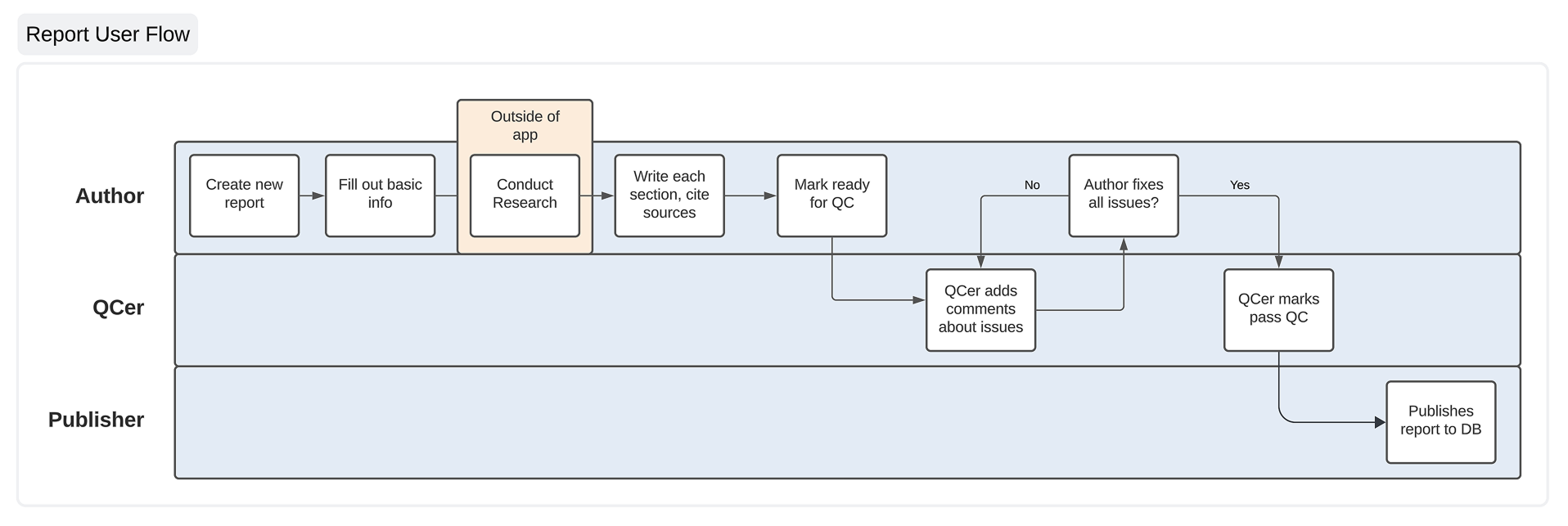
Creating an IE report is a laborious process primarily involving two roles:
Analyst: does the research and writing of IE reports
Quality Controllers (QCers): checks the accuracy of sources used and adherence to the IE-specific analytical writing style. There are typically multiple QCers on a report.
These users are doing their work in Microsoft Word, OneNote, and Excel. Going back and forth between those apps is “a clunky process.”
"I've accepted that it's going to be a hassle. I'm just going to have to struggle with this."
There are so many features and options in those apps that it can be overwhelming, especially for new analysts that regularly come into the role lacking tech-savviness.
Word, in particular, garnered the most groans. Users are provided official Word templates to write their reports, but formatting issues still occur.
“Too many options. Just get rid of it completely.”
Most analysts also find the analytical writing style difficult to get accustomed to, even those with a writing background. Despite having a guide that details how to write each type of section, it still takes several reports to get the hang of that style.
QCers use Word’s comment feature to leave feedback. However, because analysts also use comments to reference text from their sources, things can get cluttered:
Analysts and QCers have difficulty discerning between source comments and QC comments.
Groups of users are spread all around the country. Since there’s no standard, each group developed their own way of creating reports.
“It seems kind of fractured. Doesn’t even matter once it’s copy & pasted into the database.”
Too many apps. Too many windows. Too many tabs open. It’s like users are simultaneously juggling balls and spinning plates, turning the report process into a bottleneck.
Prioritization: Maintaining Momentum
We decided to work on the writing and QC parts first so that we could deliver capability and get feedback more quickly. This would also allow users to only focus on writing in Lucent and lessen the likelihood of getting overwhelmed.
When looking at the overall journey of an IE report, writing was easily the most painful part that we needed to improve upon.
For the time being, users could continue using OneNote and Excel for the research part until we got to that later (see Source Manager case study).
We were able to integrate our publishing capability so users could still get reports over the finish line in a streamlined flow (see Report Publisher case study).
I regularly reminded myself that people tend to prefer the familiar, even if flawed, so we had to be significantly better than their current process.
Report Creator Goals:
Integrate what was useful from current tools: Match users’ mental models where it made sense to ease the transition to Lucent.
Balance structure and flexibility: Users’ processes varied, but they all worked towards the same goal. I used the analogy of bowling lane bumpers that help get the ball to the end.
Establish our own standard: If Lucent was introduced as a part of training, gaining traction would be easier.
Intense customer focus: We needed to win over the right users because there was no mandate to use Lucent. While our stakeholders were fairly hands-off, it did make user adoption more difficult.
The other designer and I facilitated a workshop on which metrics we should and could track. Our devs gave great insight about what was feasible, and all of this helped our PM communicate to stakeholders in more concrete terms:
We wanted to know what specific key metrics to watch in order to measure success.
Our team had struggled with problems stemming from a lack of communication before. The other designer and I set up regular 2x2 prioritization meetings with our PM and lead dev to ensure everyone was on the same page. Any questions and concerns would often come up in these meetings where we could tackle them before they became big issues.
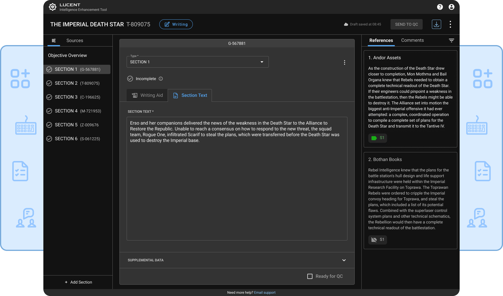
Report Phases: Fluidity Within Structure
Unlike our report publisher, we now had to take into account analysts and QCers, as well as publishers. Analysts and QCers have more of a fluid back-and-forth that we had to take into account:
The typical workflow of an IE report.
Each section’s layout was similar to how it looked in our report parser, but was now on its own page. We had heard that some user groups used Excel to keep track of what phase a report was in, so the question was how would we show report progression in Lucent?
We did A/B testing to find out:
Version A: Modes
Modes would keep each phase clearly separate from each other: Research, Writing, QC, and Publishing. One of the inspirations was Google Docs and its editing, suggesting, and viewing modes.
Feedback: Users had trouble figuring out how to switch modes from the dropdown menu, finding it “a little complicated” and “jarring.”
It also created too much friction when trying to go back and forth between research and writing, making it feel “more broken up.”
Version B: Tabs
Source management would be in its own tab, making it easy to see and switch between it and writing.
Feedback: Users found it "simpler, a little more user-friendly."
What helped us better understand why the Tabs design was more effective was when a user said, “I like that I can see everything.” So we worked to make the right things visible without everything feeling crowded.
Progressing a report with a CTA button kept each phase distinct, flowing from one to the next:
The phase badge and CTA button would be the only things that change. Keeping the layout the same in each phase made “passing the baton” feel seamless to users.
“Pretty easy to navigate. This far exceeded my expectations.”
Document Download: Constant Reassurance
We had heard about how a user lost all her work when OneNote crashed and it made her swear off the app forever. We also knew many users were on the fence about switching over to writing their reports in Lucent because it is much more work to trust a new app with.
Similar to Google Docs, we added a timestamp to let users know we were saving their work regularly.
User groups often saved their Word docs as a backup, so we gave them that option as well. If the system happened to go down for some reason, users could still download a copy of their report:
The downloaded Word doc will also have all of the required proper formatting.
Although our PM was hesitant about this feature, it turned out to give users peace of mind and was used often.
Comments Panel: Clarity in Communication
Comments in Word are used to reference text from sources and communicate between QCers and analysts. But those comments quickly pile up, especially since they apply to the entire document.
I decided it would be good to separate source text and QC comments into separate tabs. Source text and comments only appear with the sections they relate to:
Users won’t have to spend time visually filtering comments like they used to.
To leave comments, we followed the same pattern as MS Word and Google Docs:
While the popup toolbar has some options unique to Lucent, the task flow is what users are accustomed to from other apps.
To also help save space, text is partially hidden when it gets too long.
To help “check off” QC comments once they’ve been addressed, users can click the “Resolve comment” icon. They will then be hidden.
Comments are a great example of taking something users knew and tailoring it to their needs.
Spellgram: Spelling and Grammar Check
While we knew many analysts didn’t have a writing background and some weren’t tech-savvy, we didn’t think spell check would be so important. There were QCers that told us they would be hesitant to fully switch their people over to Lucent if we didn’t have that feature.
It took a little while, but one of our devs found a library we could use to implement spell check as well as grammar check (leading us to nickname the feature “Spellgram”).
This was our first step towards helping analysts improve their writing. I didn’t want to just give them a fish, but hopefully help teach them how to fish as well.
Red underline for spelling, orange for grammar, purple for style.
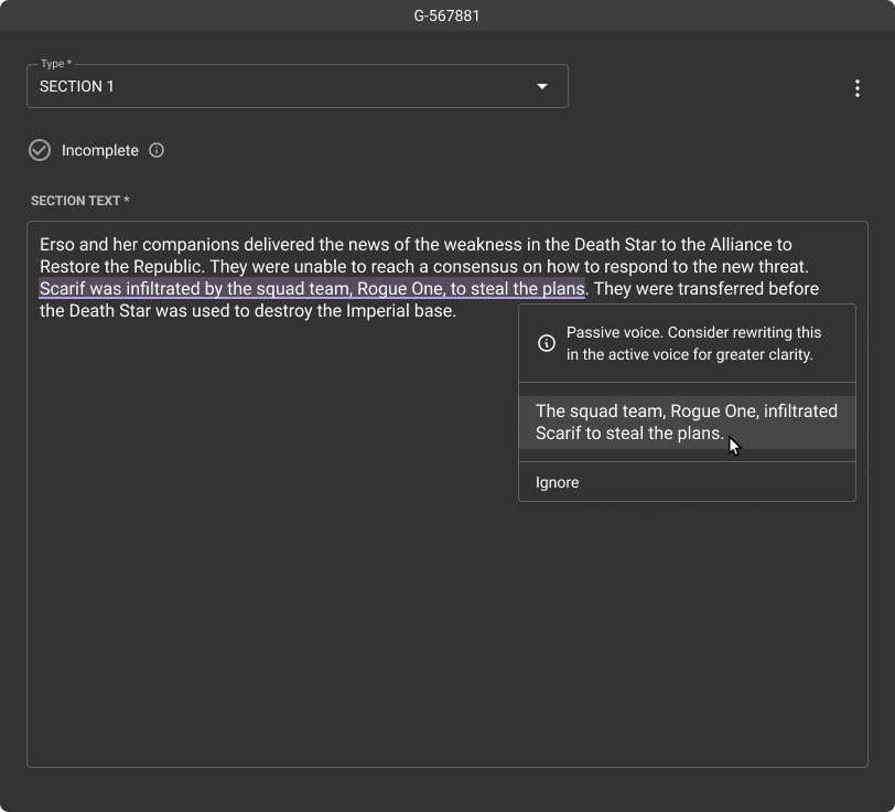
Grammar and style suggestions provide context, helping analysts communicate more clearly and avoid similar issues in the future.
Implementing Spellgram required a lot of custom work, so it was a great experience for me and the other designer to work closely with that dev to bring it to life.
Writing Aid: Getting a Good First Draft Quickly
We wanted to help analysts adapt to the analytical writing style more quickly, but we weren’t sure how.
Senior analysts and QCers have to spend 1-on-1 time with each new analyst to help develop their thinking and writing skills. Even experienced users have to shake off rust if they haven’t written a report in a while.
QCers also said new analysts can try to write too “extravagantly,” and that “they don’t need to add fluff or info that isn’t there.”
We considered some sort of “Mad Libs” template and were surprised when a couple of user groups had also tried that before:
They said the “plug and play” idea worked for very simple topics, but not for anything more complex.
A QCer told us the information in section text should naturally flow from one sentence to the next, and one section to another. The strict structure of Mad Libs wouldn’t allow enough flexibility to “wordsmith” sections.
Synthesizing writing research and ideas with the whole team to develop the writing aid.
We had some meetings with other apps about using AI to take source text and write section text, among other things. Users had thought about that too, mentioning ChatGPT in particular. They had concerns that AI would hallucinate data or that analysts would get lazy.
QCers have to be able to distinguish what’s good and bad, and how to help others develop that skill. Letting AI do all the work wasn’t something anyone felt comfortable with when it came to intelligence data
Knowing we wouldn’t be able to use AI anytime soon, we instead thought about a prompt-based approach instead. Taking their training manual that describes each section type’s requirements, we created a list of prompts analysts could answer:
They would be able to see their source text in the right panel, so it would be like an open book test. This allowed analysts to exercise their critical thinking skills and not write more than what was necessary.
Adding the writing aid into the layout was complicated in many ways because we didn’t plan for it in the beginning. We tested two versions:
Version A: Pop Out
A pop out window for the writing aid was considered, but it would have been technically complex as well as adding another window for users to keep track of:

Version B: Slide In
Sliding in the writing aid would have kept everything in view, but users didn’t easily recognize the button to open it. The sliding animation also could have been tiresome if users had to open and close it repeatedly:
Through usability tests, we also learned that users liked the idea of seeing a preview of the answers to the prompts:
Once users answer the prompts and are satisfied with the preview, they apply it to the section text.
QCers can also check the answers to see how analysts formed the result.
I was still frustrated about how to integrate the writing aid, but the other designer came up with a design that finally got things to gel:

She originally had a stepper design that I then turned into tabs.
Now the writing aid and preview were clearly separate from the section text.
Not wanting to fall into the Mad Libs trap, we allowed users to rearrange the prompts to suit the need for informational flow:
The preview updates as prompts are rearranged.
After our tests, a newer analyst as well as a QCer were eager to use this feature, asking, “Is this in production? Can we use it now?”
Like Spellgram, we worked closely with our dev to get all of the planning, styling, and interactions right. Not enough credit can go to them because they would suggest ideas or point out things we didn’t consider to improve the UX.
“I could use this when we bring in new people. It will really help with standardization.”
Unrealized Features
User groups often had multiple rounds of QC, sometimes with specific duties. We wanted to allow users to create those custom roles and assign people to them:
Tracking the report status from the right panel would also be easy and clear.
Conclusion: A Solid Foundation for the Future
Results:
66% of all users adopted Lucent for IE report creation
Increased focus: Allows users to focus on analysis, not managing multiple apps.
Efficiently store and view IE reports: No need to go through the unintuitive database.
Used by trainers for new analysts: Standardization and collaboration are made easier.
Our user adoption rate was also aided by newsletters, weekly open meetings, Q&A sessions, a feedback tracker, and hosting friendly competitions between user groups.
Through all the bumps in the road, it was invigorating to develop the close relationships we had with our stakeholders and users.
“Don’t you wish we had this when we were analysts?”
The enthusiasm that came from usability tests and demos showed us that we were addressing serious needs. Other products that only gave these users the bare minimum had come and gone, but now they have something created just for them.